Emma.fitness
Emma.Fitness is a one-woman, private, personal training service specialising in strength training for perimenopausal women.
About the Project
Emma.Fitness is a new personal training brand based locally in Bedlington, Northumberland. Emma originally approached us for the design and printing of business cards for her pre-existing brand. After a discussion of the services we provide and an audit of her current branding, we discovered a need for updated branding, including logo design, social media, domain, and a new name – a full branding package.
Emma’s brand story is rooted in her own fitness journey. When entering motherhood, Emma found herself living in a body she no longer felt was hers, and found self-love through strength and fitness training, eventually wanting to inspire that confidence in others. With a mission of improving womens’ quality of life through fitness and strength training, and a focus on premenopausal women, mothers, and longer-term sustainable lifestyle changes, Emma offers custom training programs that incorporate machine and free weight exercises to deliver the results her clients wouldn’t believe possible alone.
The brief was to create a visual identity that would align both with her professional expertise and her personality; a brand that communicates strength, resilience and approachability, whilst also aligning with Emma’s warm, supportive training style and the empowering experience she provides.
Proposed Logo Options
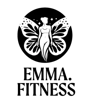

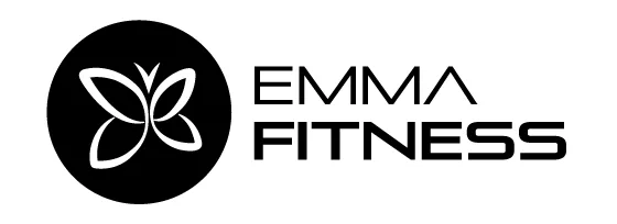
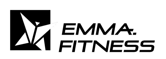
To align with her personality and journey, Emma suggested using the image of a butterfly, due to both its representation of personal growth, and her life-long love of butterflies. The image of a butterfly is unique for a fitness brand, as butterflies are typically seen as delicate and fragile – qualities that are not often associated with strength training or sport. However, we embraced this challenge – focusing on the powerful symbolism of transformation, growth, and resilience, which perfectly aligned with the journey Emma aims to guide her clients through. From this we developed several design options exploring different approaches to the butterfly imagery.
We experimented with the image, introducing some soft and flowing lines to evoke a sense of natural movement, as well as sharper geometric features to induce a feeling of strength and structure. We also tested both clear and more abstract representations of the butterfly to determine which style would resonate more closely with the client’s vision, leading to the options you see here:

Chosen Logo Option
Logomark

Icon
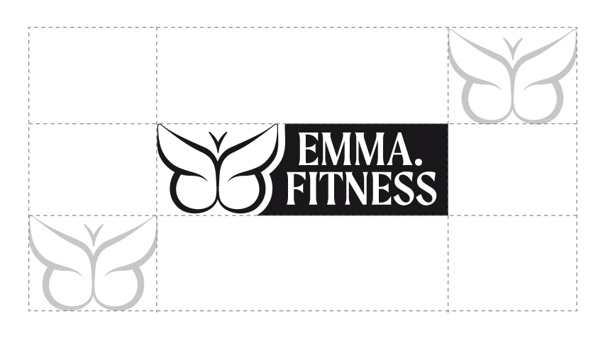
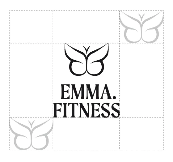
Logo Safe Zone
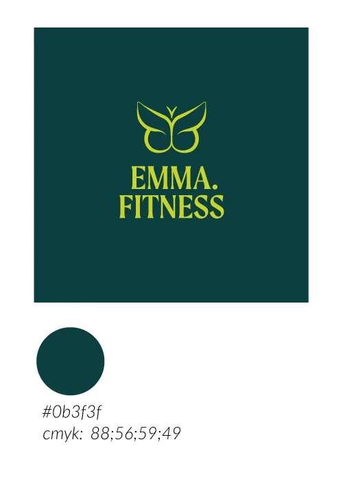
Colour Palette
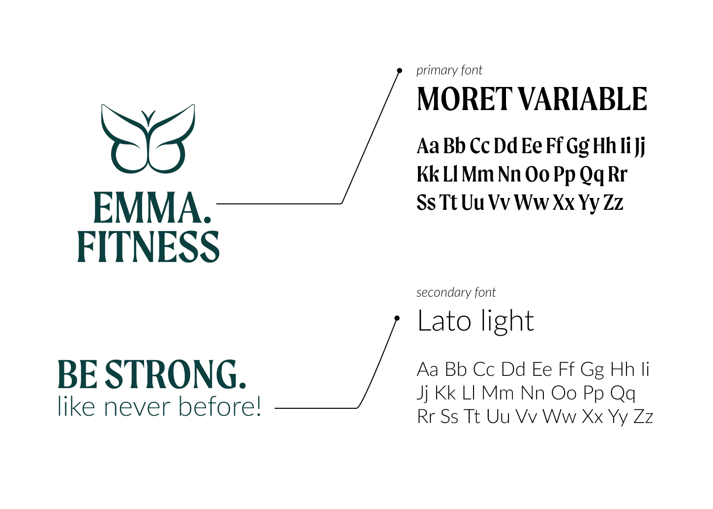
Typography
Incorrect use of the logo
